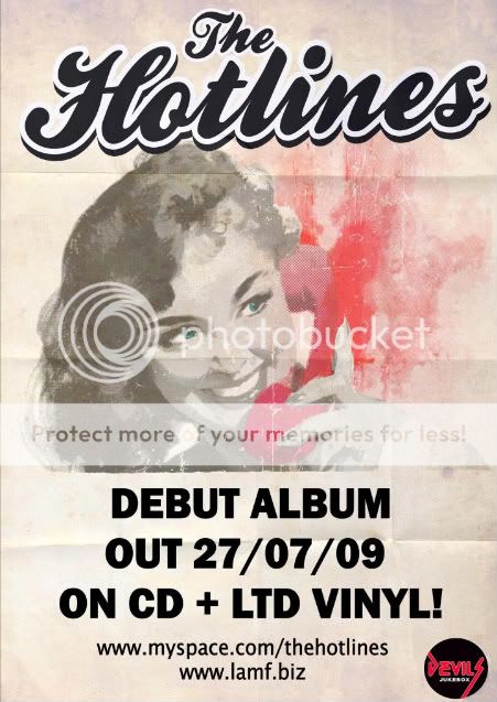
This poster uses a simple minimalist design. The use of colour here is done to emphasise the style of the band (hot pink suggests liveliness and energy). The whole poster gives off a 1950's feel, with the curly font giving it a playful feel. The limited text does not even give the name of the band's debut album, it just states that they have a debut album coming out, which is why web addresses have been provided, as those interested would go onto those websites to learn more.
In a very similar style, this poster uses a simple style to convey information. This poster has a much bolder use of colour, including a similar shade of pink, this does however link to the Album cover. Unlike the previous poster, this one includes the title name of the album, as well as an example of it, thus becomes recognisable. Like the previous poster, it has little detai about the album itself, and provides a website address, where you presumably can learn more about the album & Band.
No comments:
Post a Comment