Wednesday, 31 March 2010

Making of the Poster

I chose this photo for the poster as it emphasises the title of the song. As the man is silhouetted against the sunset, we cannot see his face, so we don't know who he is. The sunset symbolises the end of this man's relationship with his partner, or that he has realised that it needs to come to an end.


As shown from my flat plans, I have a clear idea of what I want to do. So, I will need to make part of image seperate from the rest. I do this by selecting the rectangular marquee tool, then, in the tool bar, select the style of 'Fixed Aspect Ratio', and select 2 for width and 3 for height. 


Here, I dragged the selection over the part of the image that I want to move to a different layer. Then, I selected 'Layer via cut', which seperates the selection from the layer below. After doing this, I am left with two layers.


Now, I want to darken the background so that Layer 1 sticks out, but not so much that it becomes completely black. To do this, I select the paint Rectangle tool, select the darkest black, select the background layer, fill this in black, then adjust the opacity to a satisfactory level.


After doing that, I need to make a border around the light and darker parts, as it currently looks amateur. To do this, I right click on the layer in the layer selection box, then select 'Blending Options'. In the menu that appears, I select 'Outer Glow', and adjust settings like so:


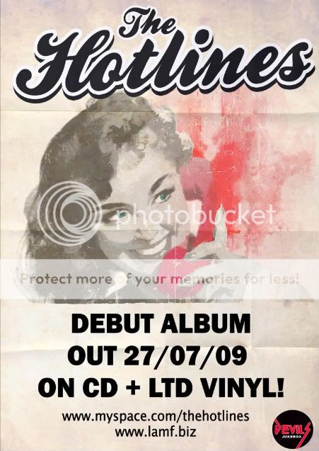
Since the base of the advert is complete, I now need to add some writing. This involves adding some fonts. So I need to copy the fonts to C:\Windows\Fonts. After adding the Text, I noticed that the space at the bottom was not adequate enough to fit all the details in. Therefore, I re-did all of my steps, except I made the selection shorter but wider, thus allowing me to add the right amount of text in. The final result is:

Tuesday, 30 March 2010

Final Video

As a music video for the Indie genre, I believe that it fits quite nicely with the music. But, in saying that, I think that there are a few minor problems with it.

The first of note would be the potentially confusing story. The characters are introduced in a way which essentially shows no background/history, thus the audience may have a hard time telling what the plot is. This is from feedback from one person, in which they stated that they were confused as to the plot.

Another person stated that they were confused by the ending (where we jump from Westminster bridge to Brighton's west pier) without a fade or story continuation leading up to it. Personally, I think that this is a fair opinion, as I do think that it jumps too quickly between London and Brighton.

But, amongst the constructive criticism, many noted that the composition of the shots, colour (i.e. White balance kept the colours fairly similar) and shallow depth of field created a nice atmosphere, and the use of familiar locations (Westminster bridge & Big Ben were the most notable) allowed them to connect with the video better.

Monday, 29 March 2010

Digipak

This is my final version of my Digipak design.


The top left panel in this image will be where the CD will sit, thus I have decided to use text rather than an image. The bottom right panel is the front cover. I have chosen a sharp, serious image of the main character, as this will immediately make the viewer familiar with the video. The lighting here is particularly good, and giving good definition to the main character's face. The expression of the character emphasises uncertainty, and perhaps could be seen as slightly evil or misguided by the viewer.

The bottom left panel is the back cover, and shows an image of the main character and his partner, with emphasis placed (by adjusting focus) on his partner. The main character is not facing towards his partner, but somewhere out of shot. This, combined with her body language shows how she feels left out and not cared for by her partner. The strong colour of her hair makes the image stand out. I have kept the text minimal to avoid potentially confusing the viewer. It also makes the design 'flow' better.

The top right panel here shows the main character's partner walking in an uncomfortable fashion. I have adjusted the contrast here to portray her as a lonely soul, who is at war with the world. Her dark clothes stand out against a bright background, and her arms folded against her body show that she doesn't feel protected. The tree in the background almost acts as a metaphor of a barrier, with it seperating her from the world.

To improve it, I think i would have done a photoshoot dedicated to this, rather than take images while filming, as this would improve quality, as well as given me more creative choice and positioning. However, I do think that the digipak design does work well.

Friday, 26 March 2010

Distracting elements.

Out of the large quantity of video that we shot, we had to re-do a few scenes due to certain elements which we had not seen prior to filming. The main ones are shown below.

Here we can observe a bright yellow dumpster in the background. This does not fit in with the general colours of the scene. However, it could be argued that it immediately draws your attention to that part of the screen, which is also where the main character appears from.

The element here is less subtle, but, if you look closely at the center part of the screen, you can see a case leaning against the wall, in front of the drainpipe. This is the case for the tripod. Also, it looks out of place.

The distraction here is quite obvious. The 'ghosts' of the windows appear because of reflections caused by the UV filter attached to the front of the lens. Taking it off improved it, but did not completely remove the ghosts.

Friday, 12 March 2010

Poster Analysis


This poster uses a simple minimalist design. The use of colour here is done to emphasise the style of the band (hot pink suggests liveliness and energy). The whole poster gives off a 1950's feel, with the curly font giving it a playful feel. The limited text does not even give the name of the band's debut album, it just states that they have a debut album coming out, which is why web addresses have been provided, as those interested would go onto those websites to learn more.


In a very similar style, this poster uses a simple style to convey information. This poster has a much bolder use of colour, including a similar shade of pink, this does however link to the Album cover. Unlike the previous poster, this one includes the title name of the album, as well as an example of it, thus becomes recognisable. Like the previous poster, it has little detai about the album itself, and provides a website address, where you presumably can learn more about the album & Band.

Friday, 5 March 2010

Camera Controls

Due to the fact that I did not use the video cameras provided, this post is about controlling the video function of my camera.

Unlike video cameras, my camera is designed as a stills camera, with video attached. Therefore, the breadth of controls is much narrower.

The whole mode is automatic, which means that aperture is not selectable. However, it is possible to achieve the same effect via a different method. Since the aperture is electronically controlled, and unlike cinematographic lenses, my lenses do not have aperture dials, It is impossible to change it manually, which would make the aperture problem much easier to cope with.

To change the aperture, I went into the photographic mode, changed the aperture to the one I wanted, then, I pressed on and held the depth of field preview button. Then, by rotating the lens slightly out of position, but still firmly in place, I have the aperture I want, and it cannot be interfered with by the camera itself. This allows for a shallower or deeper depth of field.

The white balance has many options available, including Daylight, Tungsten Lighting, Incandescent lighting and Cloudy. These can all be changed by rotating the click wheel.

Only three video sizes are available. The first is 1080p (1920x1080). This however films at 20 fps, which is under the limit for jerk-free movement. The Hollywood standard is 23.97fps, which gives films their distinctive effect. The second is 720p (1280x720). this runs at the faster frame rate of 30fps. This however doesn't meet standards either, as no system uses exactly 30fps, only 29.97fps. The last size is 480p (640x480). Again, this is 30fps.

It should be worth mentioning that during the time we were filming, canon released an upgraded model of this camera, called the 550D. This featured standard frame rates, a proper frame rate for 1080p recording, manual aperture control and 60fps 480p recording. This would have come in quite handy for our video, but, this would have meant starting it months later, which would put an inordinate amount of pressure on us. Also, recording at 1080p would put a strain on most computers including macs) and I have doubt that it would have been very time efficient to record in that format.

Presentation

As part of our project, we made (and thusly presented it) a presentation in a style similar to the way that a potential video director would present their pitch to the directors of that band's record label.